Originally Completed: Dec. 2016
Medium: Print (Adobe InDesign)
PROCESS INFO COMING SOON!
This site was recently re-designed from the ground up, and I’m still working on filling in some of the new content. Check back here later for detailed info on the research and process work that went into this project!

One of the most open-ended publication design pieces I have ever completed, this project asked us to choose a chapter from Meggs’s A History of Graphic Design and design a book around it.
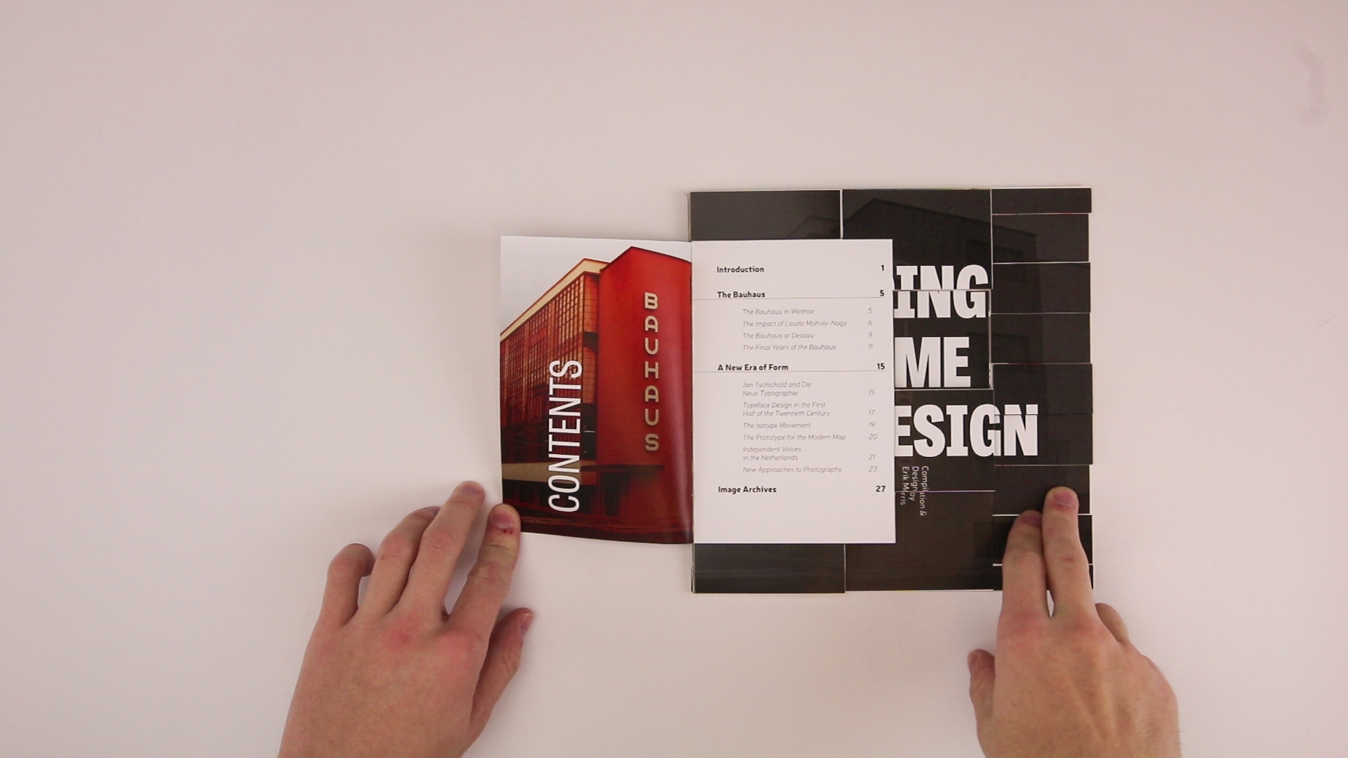
The chapter I chose was on the period in design ranging from the start of the Bauhaus through the New Typography movement. It was an incredibly influential period in design, and offered some great opportunities for play while I was planning out the book.
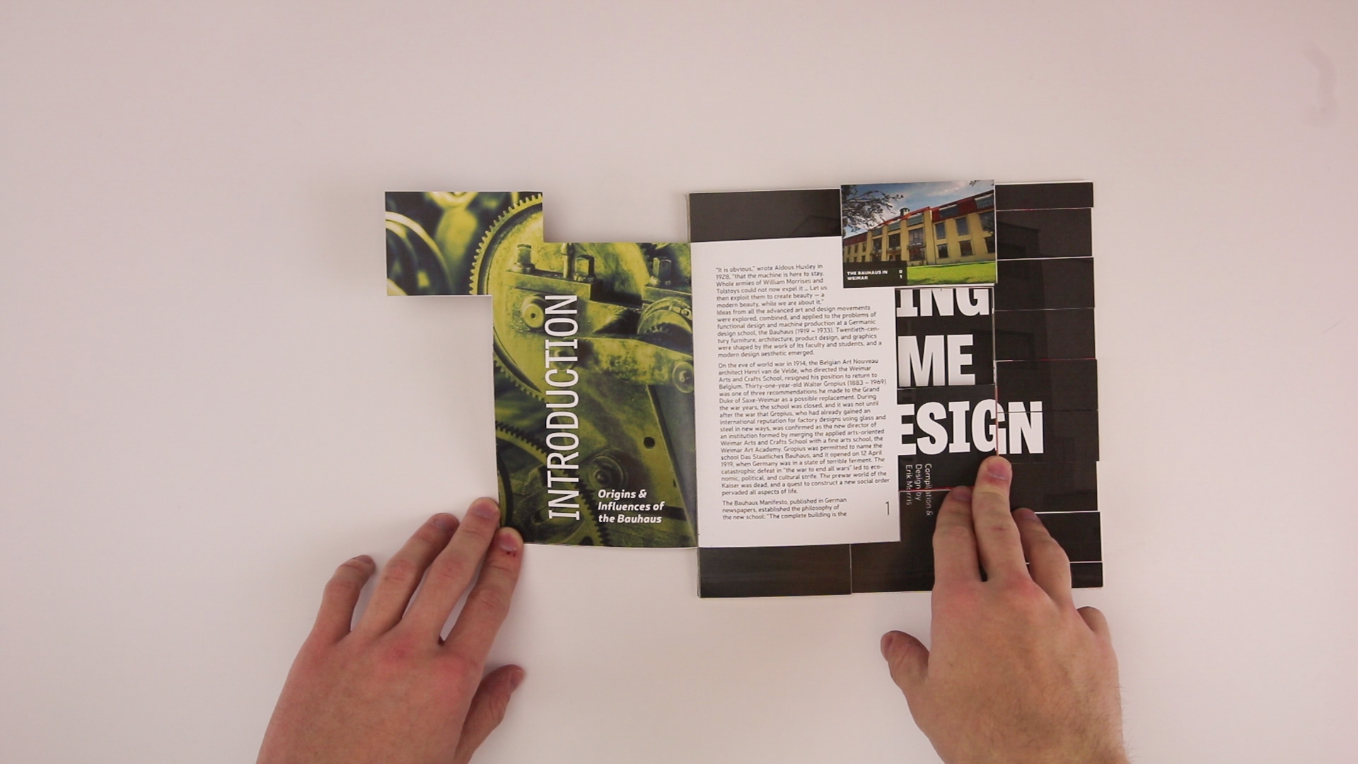
Being such a tumultuous period in design, the book's form is intended to reflect that. It starts as a traditionally proportioned book, but each page adds an extra “chunk” to the book’s shape.
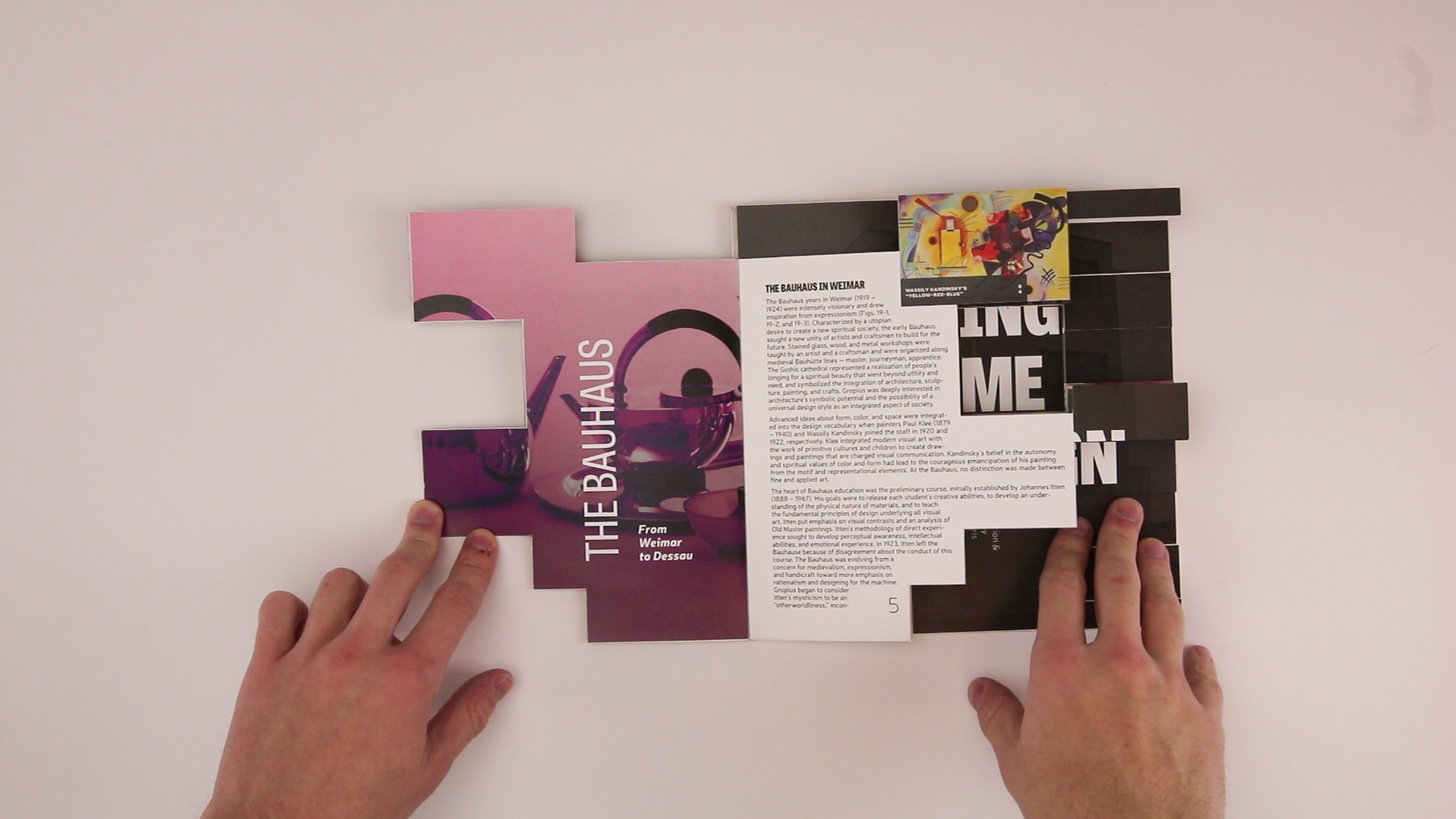
As the book’s content progresses to increasingly progressive design thinking, so too does each spread’s shape increase in complexity.

To get the layout to properly scale, I created a grid with roughly the same number of grid spaces as there would be pages in the book — thus the progression feels subtle but noticable as the reader continues through each spread.
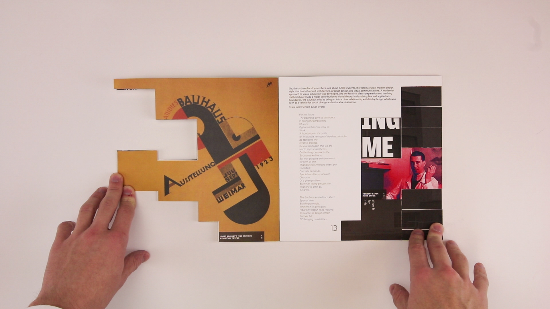
In addition to its technical complexity, the changing page shapes also provided a design challenge. Each page felt like its own micro design project, since no two were layed out exactly the same, which made the development of this book far more interesting than any others I had created before.
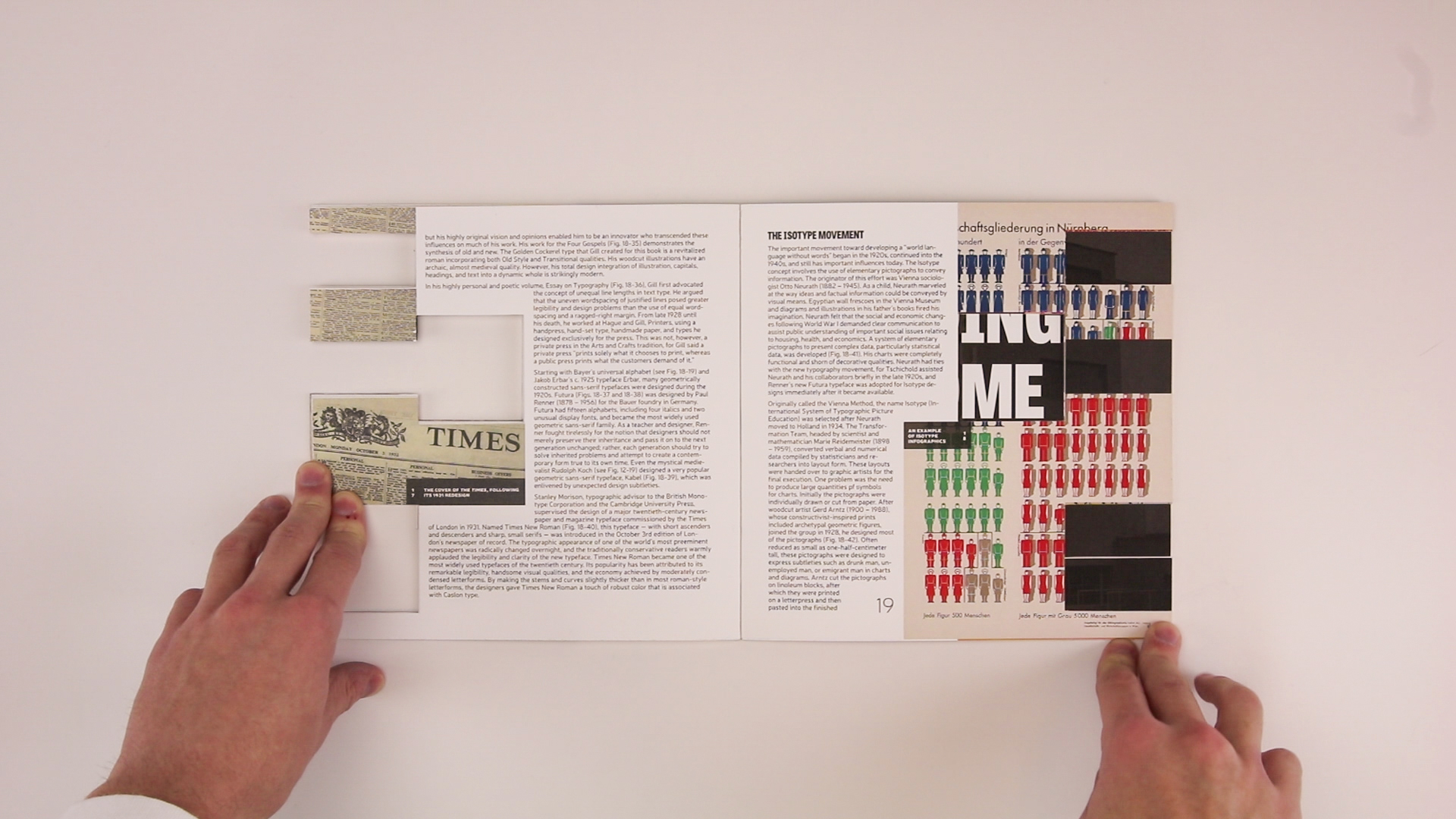
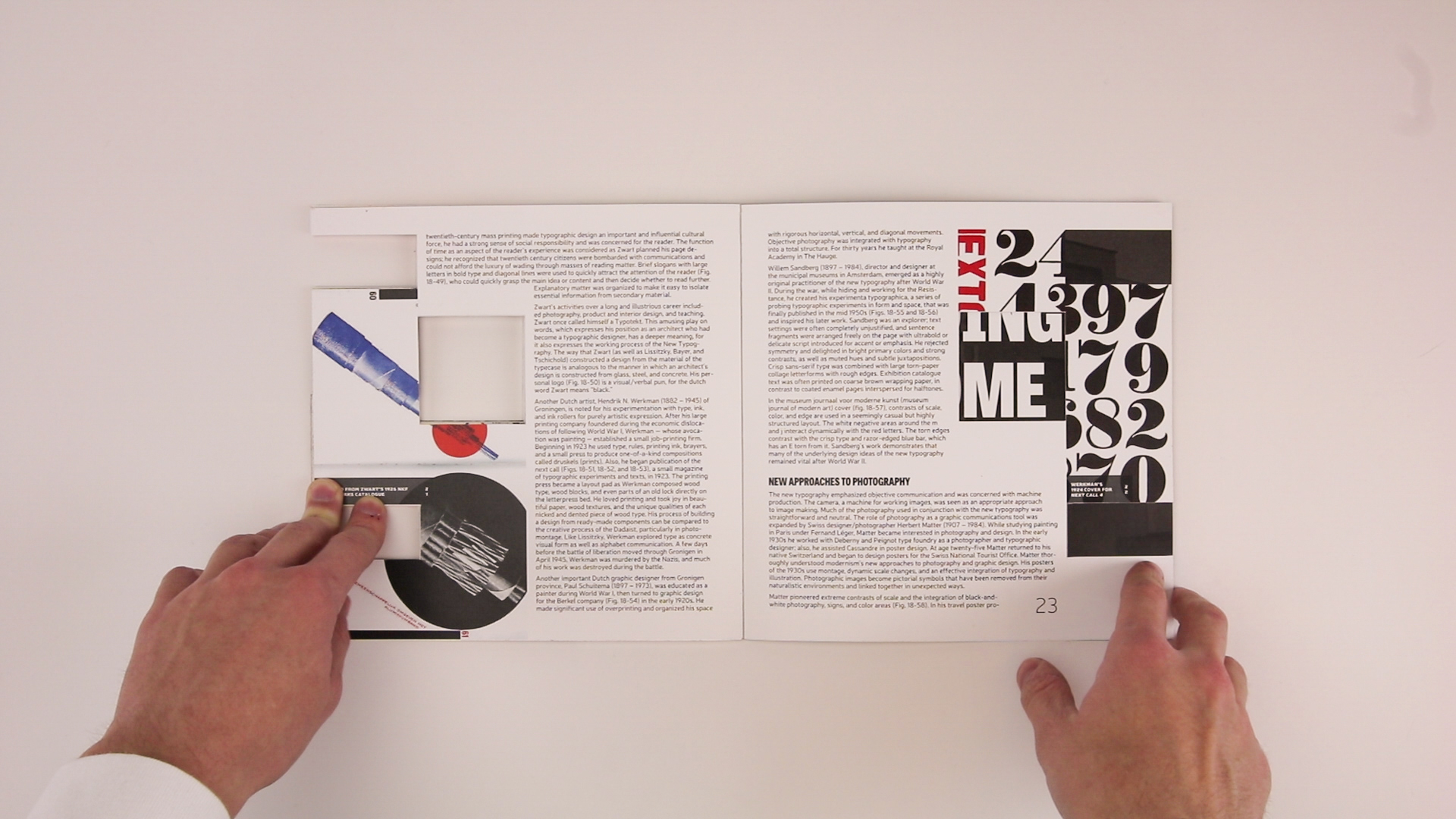
As the pages draw nearer to the end of the book, the composition begins to simplify again, becoming a full square by the final spread. The size shift reflects the transition from the region’s pre-Bauhaus traditional design mindset, to the more modernist approach that emerged once the dust settled after the Bauhaus design revolution.
Many of the images throughout the book were heavily cropped to fit within the strange confines of its ever-changing page sizes. Compositionally, this was very beneficial, but since many of the images are design pieces relevant to the text, I wanted to give readers some way of viewing them in full.
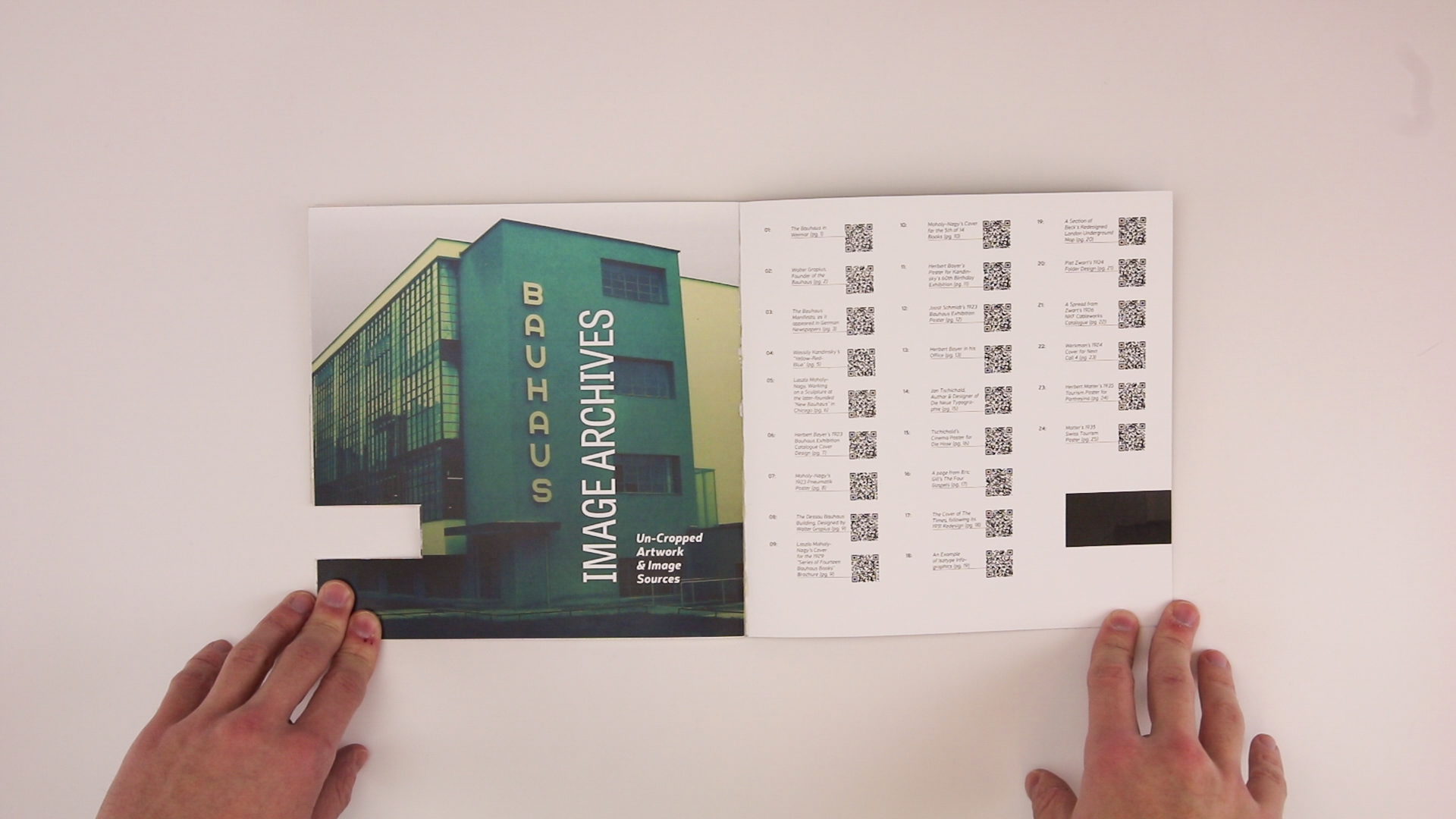
The QR codes found on the final spread lead to a micro-site, containing each of the images from the book (as numbered), uncropped and with proper citations.