Work From: May 2017 – May 2020
Medium: Digital (Creative Suite)
PROCESS NOTES
During my time at Visteon, I worked in both the Marketing and Product Design departments. This unusual career path provided me with three years of experience working on a wide variety of projects and collaborating with coworkers across nearly every facet of the company, both in person and internationally. This page covers the brand development and web-UX work I did while interning for the Marketing department, while a separate project page for my automotive UX/UI work will be added at a later date once NDAs have expired.
FURNISHING A BRAND
When I began working as a marketing intern at Visteon, the company had just completed their first major brand overhaul since its inception in 2001. The new brand guidelines had been mostly created by in-house designers on a small budget. While the team did a great job under these constraints, this did leave the new brand guidelines feeling slightly underdeveloped. The library of visual assets available was fairly minimal, so I decided to use each project as an opportunity to flesh out the new brand a bit further.
One of my first intern projects — creating a series of corporate culture posters for a new office location — provided a great opportunity to begin expanding upon the brand guidelines. One of the major missing components of the updated brand identity was any sort of structural elements. The brand had a number of existing icons and visual elements to work with, but no established structural elements to tie them together.


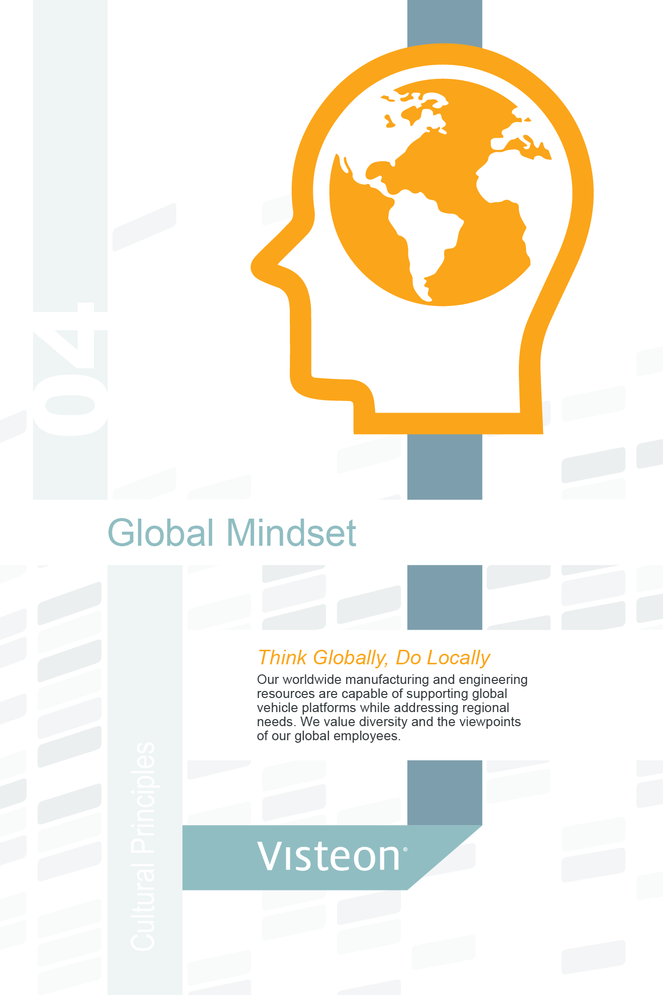
When considering new compositional elements for the brand, a major factor I had to take into account was accessibility. Despite being a global company, the marketing department only consisted of a little over a dozen employees world-wide. This resulted in extreme inconsistency across the company’s visual media, as employees in the engineering and manufacturing departments would often have to design their own PowerPoint presentations for client meetings. One of the main goals of the refresh was to alleviate this issue and make the brand more accessible to employees with minimal access to design tools: hence the switch to Arial as the brand’s main typeface. In keeping with this goal, I tried to make sure any new brand elements I introduced could, in theory, be replicated by someone using only Microsoft Office and our library of visual assets.
I decided to go in a loosely Bauhaus-inspired direction with these posters to tie in with the theme of innovation and experimentation the company was promoting at the time. The geometric ribbons of color and use of large-scale iconography proved to be an effective way of utilizing the existing brand elements in a more compositional setting, and went on to inform much of my later marketing work.
The color ribbons used in these posters eventually became the basis for the “roadmap”, a compositional element used throughout many of my subsequent marketing projects. The geometric ribbons and dotted lines not only evoke the automotive theme and forward-thinking mindset, but also have the added benefit of being extremely easy to produce. A similar effect can be created using only the default shape tools in PowerPoint, and I was pleasantly surprised to see this visual element show up in several employee-made presentations after I began utilizing it in various facility graphics.


A followup poster series, this time showcasing some of the company’s varied product lines, allowed me to further refine this visual language. I found that utilizing the color ribbons as a framing device could help to better tie our product photography with the rest of the brand assets. These early posters also began establishing elements of the “Roadmap” (see above process notes), which would eventually become an iconic visual element within much of the company’s print collateral.
While developing these early print assets, one issue that quickly became apparent was the quality of the existing iconography. The existing brand icons had mostly been pulled from several different stock image libraries, so stroke widths, image sizes, and visual language varied wildly from icon to icon. Additionally, many were only available as raster images, making it difficult to utilize them properly at large scales. As sort of a personal project, I took it upon myself to update the 100+ icon library, making each visually consistent and available in full vector-graphic glory.
Since many of the original icons were already in use across a wide range of marketing collateral, I tried to keep the revised icons as visually similar to the originals as possible so that they wouldn’t look jarringly different from the originals. During the visteon.com re-design process, it was also brought up by a consulting design agency that the old icons looked a bit dated compared to the current trend of slim, lightweight icons with thin strokes. To address this, I created two versions of each icon — a “Light” weight with thin strokes and large counterforms, and a “Heavy” weight for use when the icon is reversed out of a darker background.
In addition to revising the old icon library, I also created a number of new icons for the set. Many of these were intended to convey rather complicated concepts centered around business strategy and autonomous driving, so I utilized bits of the original icons to develop a modular visual language for the icon set.

CORPORATE, COLORIZED
Upon beginning my internship with the company, one of the first things I noticed was how static most of the existing marketing collateral looked. The previous brand identity was extremely underdeveloped, resulting in wildly inconsistent usage of assets and emotionless visual compositions. The facility graphics were especially lackluster, mostly featuring the same set of outdated product photography and event photos. Some wall graphics even featured group photos of employees who had all left the company by the time I arrived.
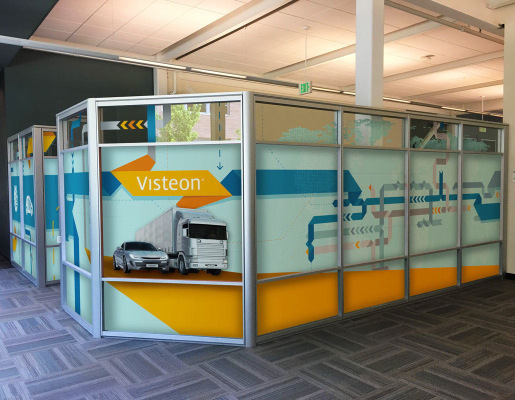
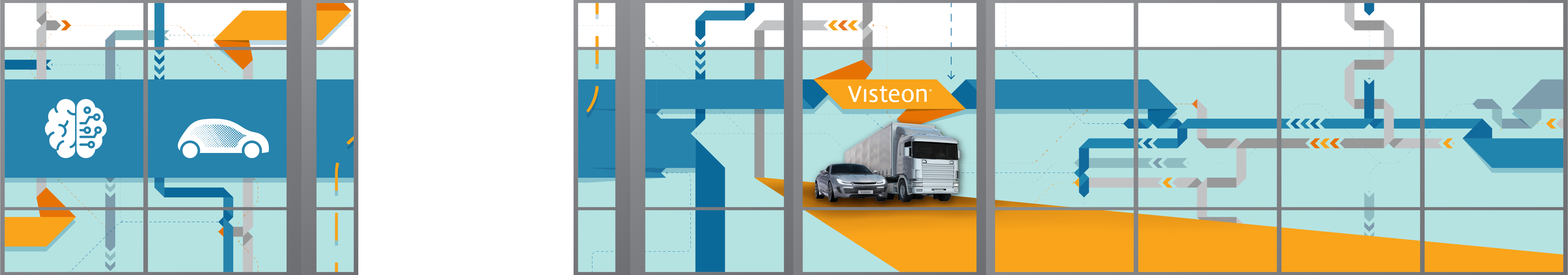
Thus, when asked to re-design some of the facility graphics for the company’s various global offices, I used the opportunity to bring some more color into the workspace. By scaling up and expanding upon some of the brand elements I had developed prior, I was able to create a series of large-scale wall graphics (such as the above photo, taken from Visteon’s offices in Shanghai). I utilized existing brand elements like the roadmap and city-scape to create a sense of motion across each composition, helping to break up some of the beige monotony found within the company’s offices.
The updated brand guidelines were a bit limited in terms of decorative assets — in order to add some more variety to the facility graphics, I created a world-map in a similar visual style to the existing “dataflow” and “cityscape” brand assets. The stylized worldmap not only provided a large-scale background element for use in facility graphics, but also worked well as a tool for infographics, providing a brand-consistent method for highlighting countries and office locations.
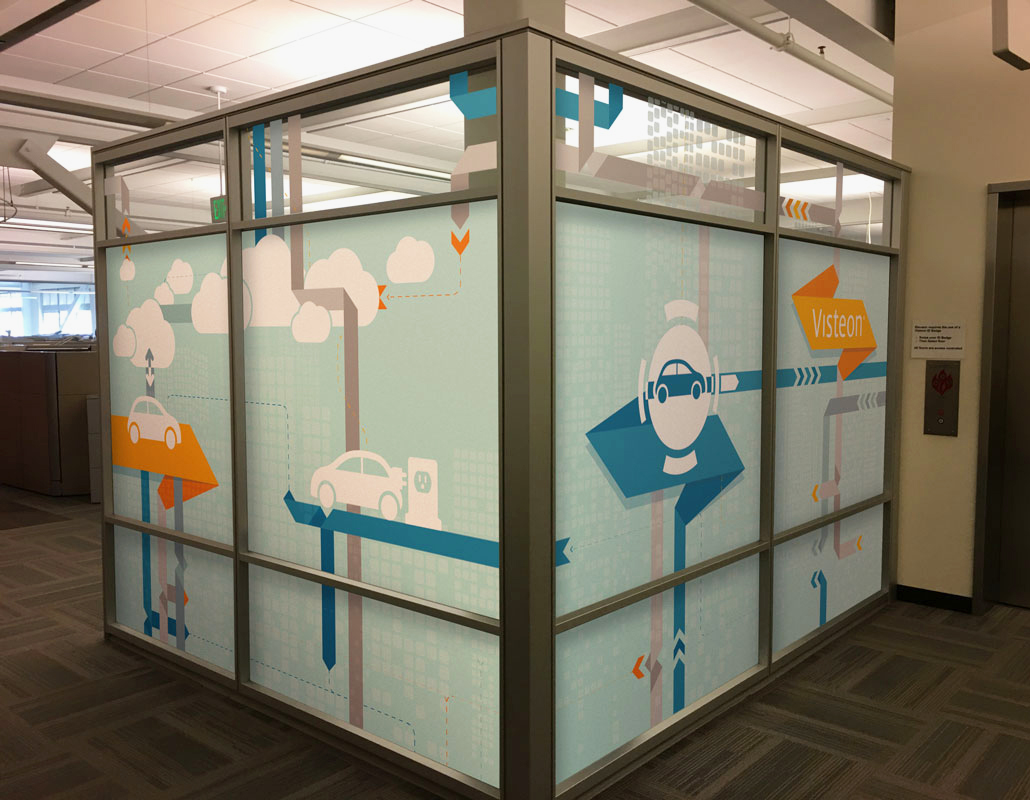

Wall graphics were where the new brand assets I had created really began to come together. Icons interacted with roadmap and background elements to create compositional environments highlighting various aspects of autonomous technology.


When designing facility and event graphics, I applied motion-design principles to try and make each composition feel less static. I created a system for how the “physics” of the roadmap elements might work, ensuring every intersection of two or more lines behaved in a semi-predictable way. This set of guidelines made it so that, despite being printed on a static piece of vinyl, the wall graphics still gave the sense that they could start moving and shifting at any time.
The increased use of color and motion spanned anything from event displays to internal documents. Introducing more structural elements to the brand guidelines provided more opportunity for play in the composition of print collateral (such as the below promotional brochures for Visteon’s offices in Japan), which previously would have consisted of bare-bones text on a white page.


While many of the brand elements I introduced were very systems-based, I was also an advocate of breaking away from our own brand guidelines whenever it made sense to do so. When Visteon partnered with the American Center for Mobility in 2017, I created a series of retro-futurist posters and brochures, utilizing some of the brand’s colors and assets while departing dramatically in terms of style.


MARKETING MEETS UX
One of the first UX-adjacent projects I took on during the marketing internship was the company’s communication issues regarding its more advanced autonomous technologies. Visteon had been conducting business-to-business sales since 2001, but the additional complexities of autonomous technology were beginning to make sales-pitches a bit difficult. Technologies like lidar and concepts like levels of autonomy are a lot harder to visually showcase than an instrument cluster or center display, and sales reps aren’t always experts in autonomous lingo. To address this issue, I created a series of info-graphics for use in presentations, each highlighting different aspect of the autonomous technology Visteon could provide.

Around the same time, the company was also beginning the first major overhaul of its website in over a decade. The previous site had been built sometime around the company’s founding in 2001, and had been slowly modified and added onto ever since. This piecemeal process resulted in a Frankenstein’s monster of old and new content, so we had to completely re-think the site’s basic structure and hierarchy going into the re-design.
Since the site needed to be re-built from the ground-up and nobody else on the marketing team had any formal web design experience, I took on most of the back-end UX work for the new site. Though I did not design much of the final UI (a third-party web design company was brought in to handle that aspect of the project), I was responsible for cataloguing all of the content from the old site, creating personas and use-cases for where user experiences could be improved, and wireframing the content structure for the updated version. Though there have been a few minor modifications since, the majority of visteon.com’s current incarnation is structured around my original UX work.

The previous site, being over a decade old, was definitely showing its age. The home page was extremely text-heavy, the site itself was entirely non-responsive, making it next to unusable on mobile, and the navigation was inconsistent and confusing. Someone had seemingly decided at some point that every page should have redundant links to nearly every other page (despite the fact that nobody would ever need to get from, say, the investor page to the careers page), but despite this, the header wasn’t always the same on each page, making navigation incredibly convoluted.

Going into the new site, we wanted to focus on getting users where they wanted to go as quickly as possible. I started by considering who our typical users would be and why they might be trying to access the site.
To address these primary user needs, we restructured the site to a more modern, long-scroll layout. We included all the necessary page nav in the header, but also included large-scale callouts on the homepage for the most important content such as news, products, and careers. The final product provided a much needed simplification of the site’s page navigation, and (based on data from Google Analytics) drastically reduced the time it took for users to find what they were looking for.