Ongoing Projects
Medium: Digital (Creative Suite)
PROCESS NOTES
Between CCS coursework and my own personal experiments, I’ve completed a lot of type-design projects too small to justify their own project pages, but still interesting enough that I wanted to include them here. This page, unlike others, represents a compilation of smaller works rather than one unified project.
VISUAL DEFINITION
An exercise in both type design and composition, this CCS project asked us to create four custom word-marks, then design a series of posters around them.


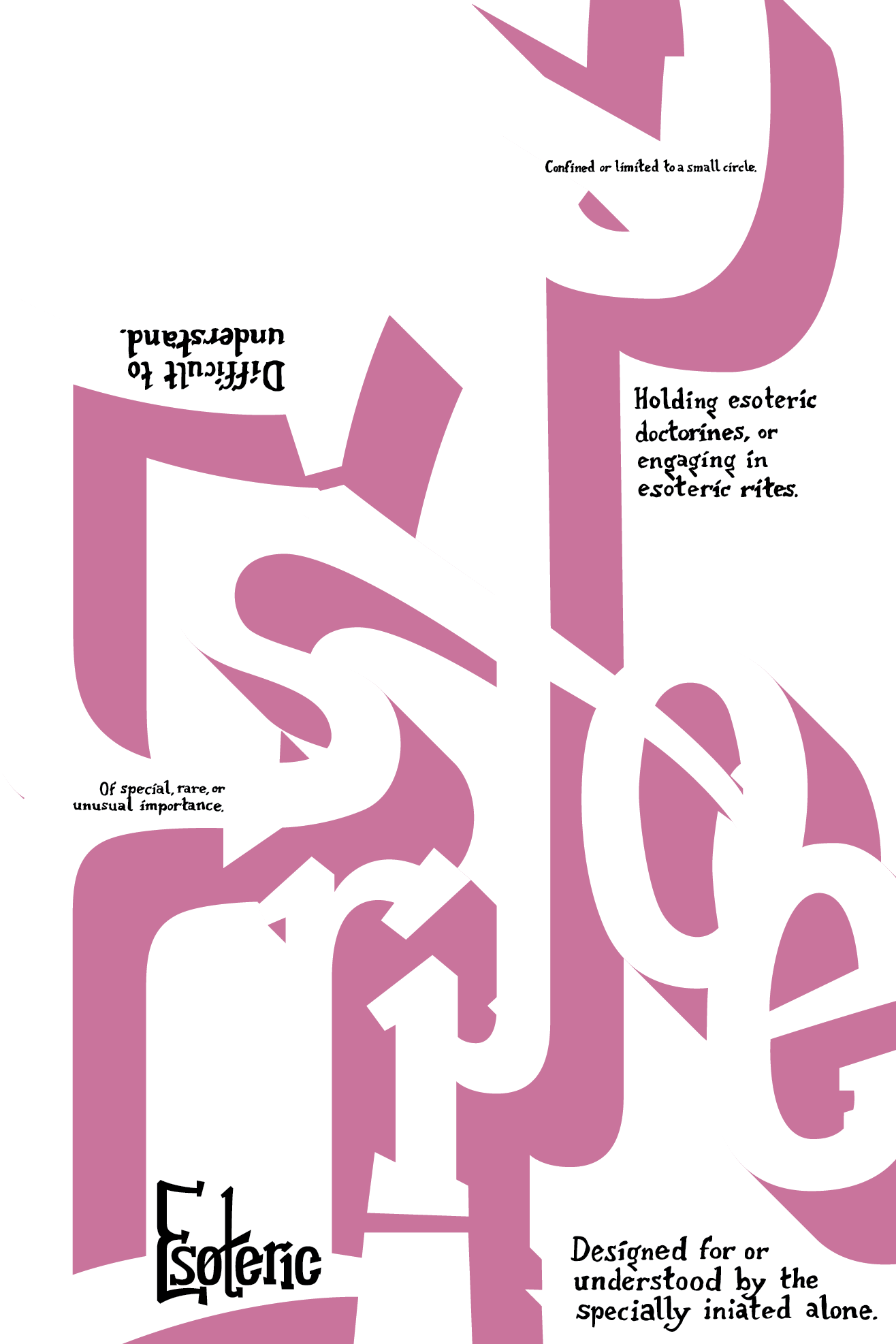
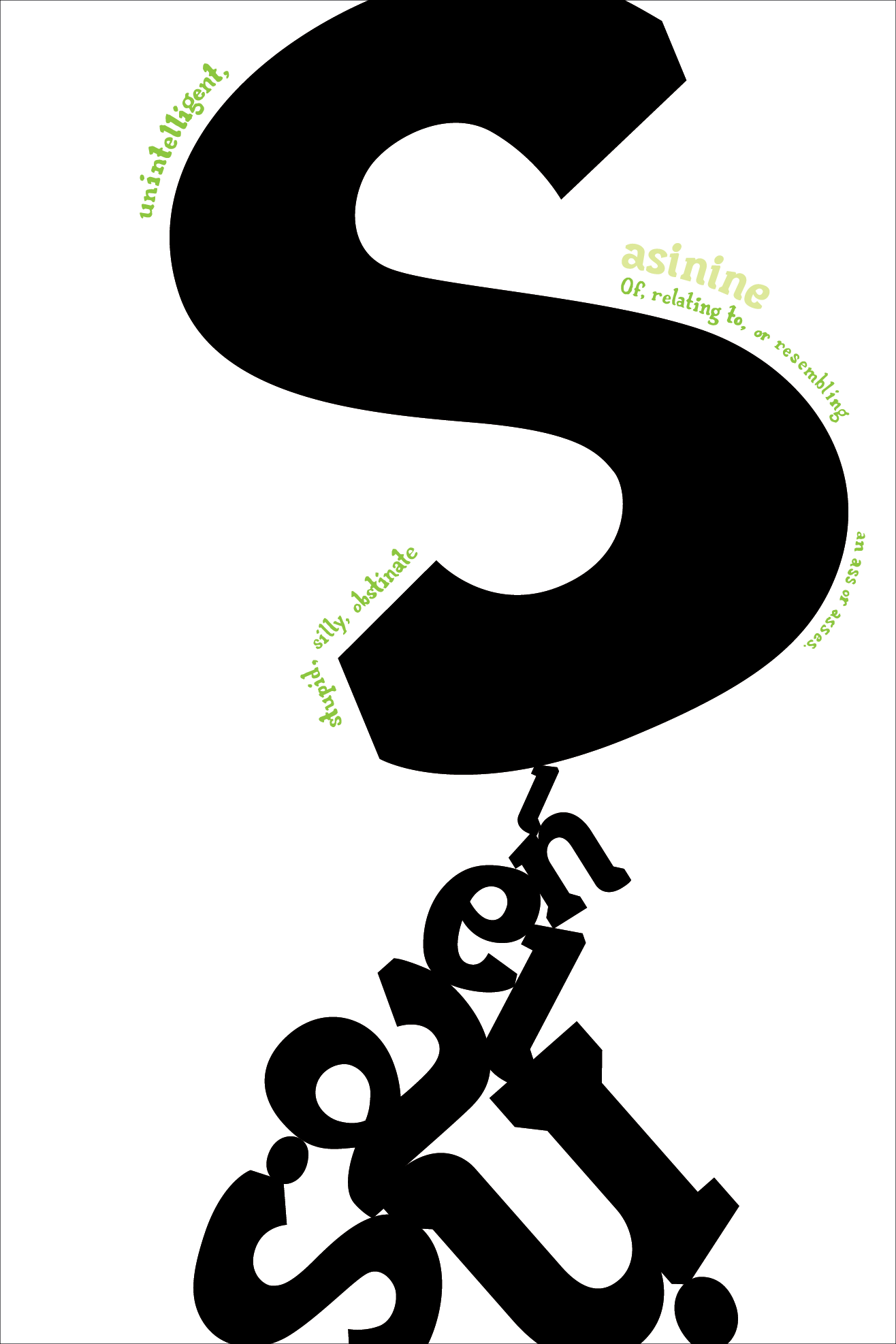
My poster series was loosely themed around the idea of a visual dictionary. I chose four infrequently-used words, then created a visual representation of each through the composition of their respective poster. Interspersed throughout each composition are hand-written quotes from various dictionary definitions, serving to reinforce the definition theme.
The exercise actually began as a group project. We were initially divided into small teams, each provided with a kit of parts — yarn, thumb-tacks, wooden shapes, etcetera. We were then asked to create as many stylized letterforms as possible in a short period of time, using only the provided materials.


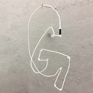


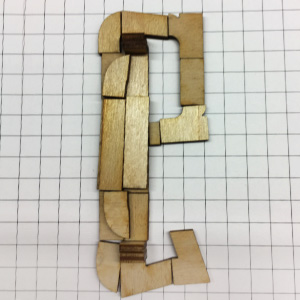


Following this exercise, we were instructed to select four of the letters we created and use each to develop a unique wordmark. I decided to start by digitizing each of our letterforms — flattening the complicated physical letters we had created made it much easier to identify their unique characteristics and see how those traits might be extrapolated to form other letters.


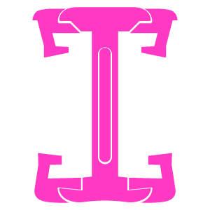
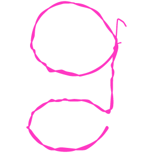


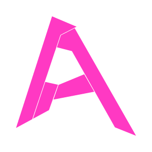

After digitizing all the letterforms we had created, I narrowed my selection down to the four highlighted above. They all shared a kind of blocky slab-serif motif, which made it easier to make them all feel visually cohesive as a poster series.


The words themselves were chosen largely based on the feel I got from the first few letterforms I created for each mark. The mis-matched stroke weights of the first poster felt almost like the letters were fighting with themselves, so the word Quarrelsome came to mind. The tail on the Q punting the R into the air became the inspiration for most of the first poster’s composition, where this visual gag is greatly enlarged and exaggerated.
I had a lot of fun with designing the wordmarks themselves, but the poster portion of the project was actually more difficult for me. Over the years, I’ve learned that I’m a very goal-oriented designer; if given a problem to solve, I can design a solution without issue. However, I tend to struggle a bit when it comes to more open-ended projects. So when prompted to design a poster series without any pre-defined content or intended message, I had to mentally restructure the project for myself before I could really approach it.


The swooping curves and hard stroke-ends of the second poster felt reminescent of a sloppily hand-painted sign. The disjointed strokes reminded me a bit of those childrens’ workbooks that give line-by-line instructions on how to draw each letter, which ultimately became the inspiration for the second poster’s composition.


The angular serifs and unorthodox curvature of the third poster gave it a vaguely mysterious feel, like something you might see at a niche roadside museum in the middle of nowhere. The third poster’s background is reversed out to reflect this.
While working out how to approach the poster portion of the project, I found it helpful to hand-draw full-scale versions of each poster before moving into the digital space. I had begun prototyping digitally at first, but I found most of my early attempts at composition ended up feeling sort of lost in the space of the poster. Working physically forced me to slow down and consider each element of the composition carefully as I drew it, leading to layouts that felt overall more grounded on the page.


The final poster’s typography was extremely bold and chunky, the curved serifs on the Ns and Is resembling the feet on some slow, lumbering animal. The teetering stack of type in the poster was meant to evoke some sort of grueling, but ultimately meaningless pursuit, doomed to fail from the start.
READING SOUND
This CCS poster project prompted us to record three sound bytes over the course of a day, then create three typographic posters based on each clip.
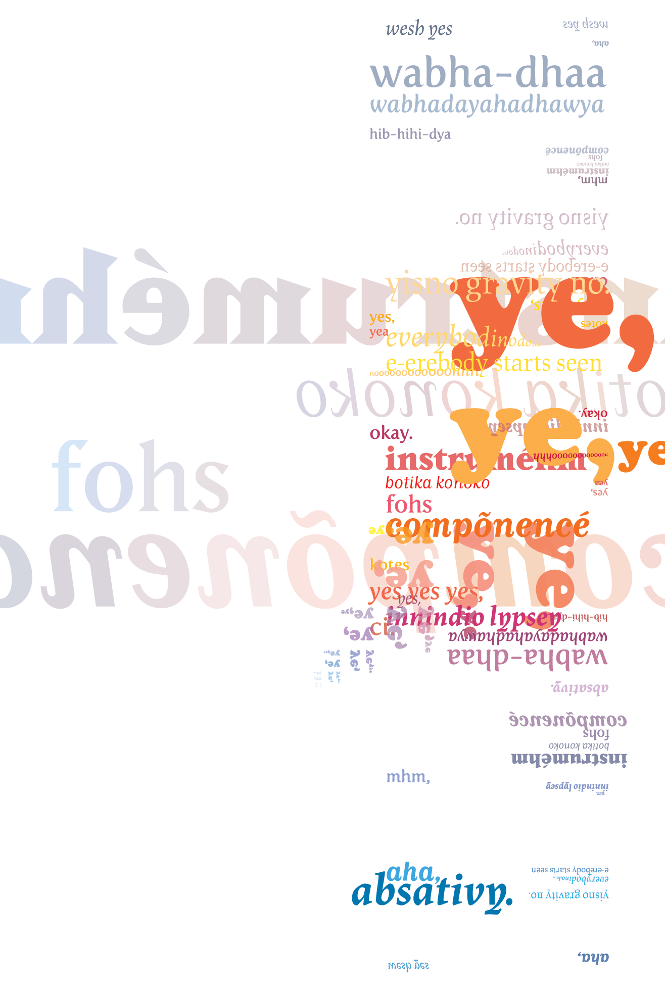


The first poster in the series was based off of a recording taken during a class work session. I deliberately left my phone in my pocket for the duration of the recording, causing the entire clip to sound distant and muffled.
I began designing the posters by breaking each clip into its sonic components, then tried to come up with a different typographic method of visually representing each sound. The first poster utilizes color to represent the fits and starts in conversation, the quieter moments appearing in cool blues while the more layered, noisy portions of the clip appear in vibrant reds and oranges.
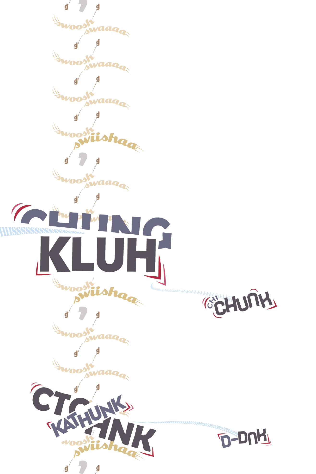
Poster two was based on a recording taken while walking down an echoing hallway. The quiet swishing of jeans is occasionally punctuated by the metallic clang of double doors opening and slamming shut.
While most visual elements represent individual sounds within each clip, some exist as “punctuation“ to better illustrate the timing of each clip. The grey commas in the second poster, for instance, represent the pauses between each swish of jeans.
The final poster’s recording was taken during an elevator ride. The muted mechanical sounds of the lift mechanisms were interrupted only by the occasional beep or vocal clip announcing the elevator’s arrival on each floor.
I went through many iterations while figuring out the composition on the final poster. The prompt was fairly specific about using only typographic elements within each poster — however, I wanted to create some sort of structure to evoke the confined space of the elevator. The final composition uses two massive “H”s to frame the composition, with the “elevator shaft” in the center being filled with grey letters representing the subtle white noise present throughout the entire clip.
TWO-HOUR TYPEFACE
An ongoing personal project I’ve been working on since 2019, the concept behind a Two-Hour Typeface is to create a set of rules and guidelines, then create as much of a full typeface as possible based on that system within the span of around two hours. The exercise usually results in extremely unorthodox typography, the style of which I often didn’t expect when designing the font.

The first (official) two-hour typeface, Funkabrutalism, answers the question, “What if Futura was a Didone?” Constructed out of basic geometry on a simple grid, its tall, narrow counters give it a vaguely elegant feel, while its blocky capitals contrast awkwardly, evoking cinderblock bookends on an otherwise posh bookshelf.
The system behind Funkabrutalism was actually one of the simplest of any two-hour typeface. Each letter was created using a 3:5 rectangle; the lowercases were built within the space using only basic polygons, while the capitals were chiseled out of a solid rectangular fill using only single lines of a uniform thickness. I then polished the typeface up by adding simple details like rounded corners and subtle serifs which served to make the font more legible.

The second two-hour typeface resulted in a funky sans-serif that looked as if it had been conceived by an inebriated architect in a 1920s speakeasy. The font itself was based heavily on the golden ratio — hence the name — and nearly every element within it can be traced back to this ancient piece of geometry.
The grid for The Grold Sansdard is literally just two golden ratio nested-rectangle formations stacked on top of each other. While simple in concept, it actually proved rather difficult to work with. The rectangles get exponentially smaller in each layer, so the resulting font ended up with extremely small counterforms and comparatively massive, lopsided strokes.

For my third two-hour typeface, I took a slightly different design approach. Rather than basing the font on a grid, I instead decided to try constructing each letter using only equilateral squares and triangles. This design direction resulted in an incredibly unorthodox typeface; since the squares and triangles were of different heights, the height of each letter ended up varying greatly. I tried to keep everything as visually coherent as possible, but in the end there still ended up being two different x-heights, two capital heights, and several different baselines, resulting in a font as bizarre as the obscure fictional fast-food restaurant it was named after.
When designing Isoscelese Fish Sandwich, I deliberately tried to build the letterforms using as few shapes as possible. Initially, I had tried working with more complicated forms composed of dozens of shapes, but I found these ended up looking too much like a standard typeface, and lost a lot of the charm of the polygonal geometry. Reducing the number of shapes per letter forced me to come up with more creative solutions, resulting in a much more visually-compelling typeface.
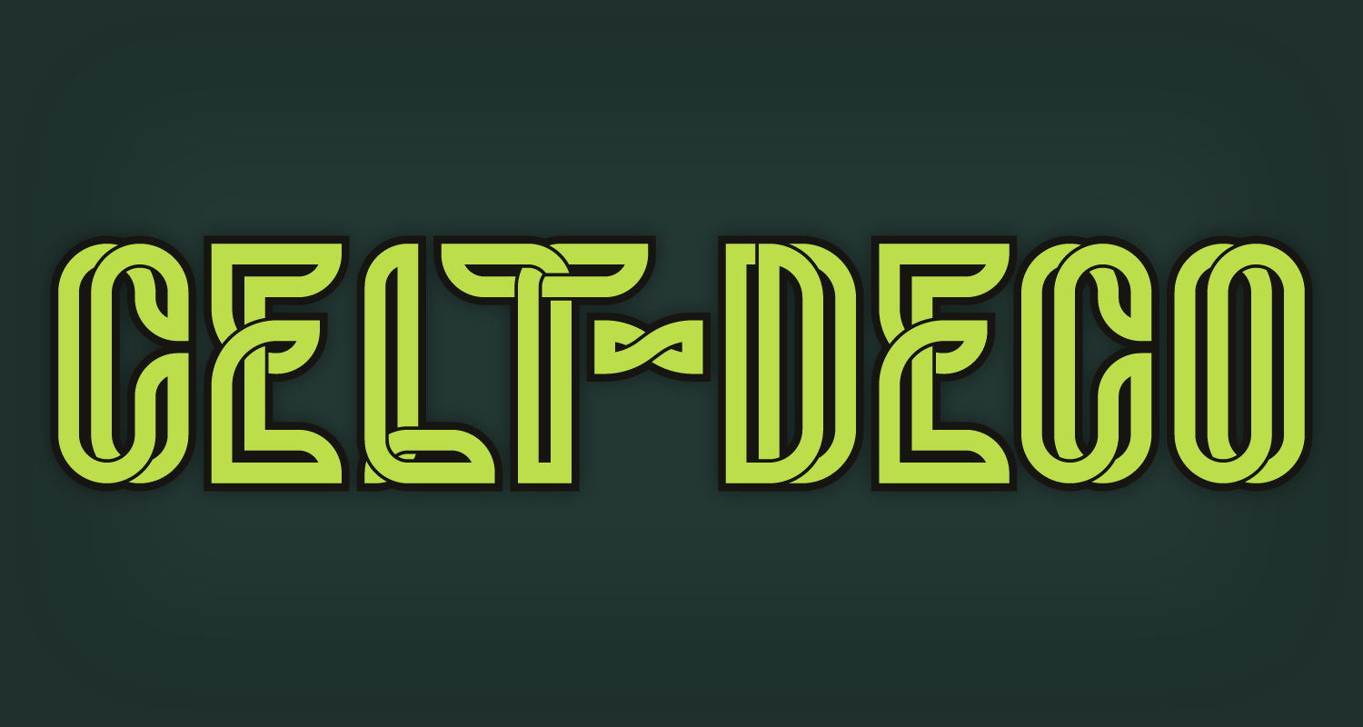
The fourth two-hour typeface was by far the most visually complicated, but also one of my favorites overall. The initial concept was to try and make an entire typeface out of celtic knots — however, the final product somehow ended up resembling the art-deco ornamentation commonly found on 1920s facades (hence the name). The typeface ended up being so mechanically complicated to set up that I was unable to finish the full alphabet within the time provided, but I do hope to revisit the concept and finish the typeface eventually.

Two-hour typeface five began as an homage to the spray-painted utility markings commonly found on the sidewalk during construction in urban areas. However, as I was developing it, it took on more of a viscous, almost fluid-looking form. The end result differed from my original intent, but has still ended up being one of my favorites out of the set.
Despite looking extremely organic, the logic behind Ghoulash was actually even simpler than most of the others. I first set up a basic grid of squares, then drew each letter using only straight lines. From there, all I had to do was smooth each shape out using Illustrator’s round corner tool in order to get the flowing organic shapes seen in the final font.

MORRDULAR SANS
The rounded square typeface used throughout this site as part of my personal brand was technically the first “two-hour typeface” I ever completed. The system behind the typeface, as mentioned in my about page, is extremely simple and ties into the uniform grid used throughout this site. Each letter is composed on a 3x3 grid, with details being added only by cutting thin lines through the square space of each letterform.
Initially, the font wasn’t even meant to be a large part of my brand. It was actually created during a hasty last-minute ideation session I had done prior to a CCS class critique. I knew I wanted to do something modular with my identity, but I wasn’t sure what, so I started randomly sketching a bunch of grid-related visual concepts to see if I could come up with anything useful. Skewing all the text to fit the grid was a concept I sketched almost as a joke, but I liked the result so much that it ultimately became a core piece of my personal brand.


The original font started out with only capital letters, but has since recieved numerous additions including lowercases, numbers, punctuation, and iconography. I even developed the font into a usable typeface, complete with six alternate weights.

Morrdular’s alternate weights are all based on the same grid, with the intent that, when used at different scales, the width of the gap between letters will always stay the same. This allows the font to be used at almost any size without noticeably breaking from the grid.